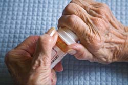
This picture shows the simulation for test we did in class, where we use masking tape to tape around our knuckles and finger tips to limitation the movement of our fingers. It’s simple, we can’t bend them as much, we can’t feel the texture of the material as much, and we feel weird and limited in general. That’s just one small part of the story—people that with hand disorders, people that suffer with diseases or accidents, or elderly that might lose some of their strength and senses—are struggling opening their pill bottles every time they try to take their medicine. The ability of using your hands and wrists to pinch, bend, twist or as simple as hold something stably might seems easy for those who blessed with healthy hands, but ironically those that needs to have medical care are the ones that are struggling with open their pills bottles. 

The current design for pill bottles are almost universal—smooth cylinder body with a push-down-and-turn cap. I admit that I have to try more than once to open a bottle like that, and I have seen my dad battling with the cap for minutes and ended up taking his pills angry, and he is a healthy 55 year old lad! When we want something to have less traction we would make it round. However for pill bottles we need to create even more traction so they will be easier on our hands especially with dexterity problems. I did the following sketches where I explored various shapes, mechanism and different ways to access the pills. What’s more I dedicated several design options for dividing pills by days so it’s less confusing for people who need to take different medicine. In the meanwhile I take consideration that these bottle will be used for both doctors to refill a large amount at a time and patients to take a small amount each time. I also tried to address the difficulties that left-handed people might have encountered.
B. Brainstorm  After brainstorming and discussing my sketches with fellow designers, I narrowed down my ideas to focus on designer a refillable bottle that is
- intuitive to open and close
- easy to access to pill in a controlled manner
- considerate for both right handed and left handed people
- refillable
C. Five Preliminary Ideas
Here are the five product ideas I came up with based on the goals above.
During drawing review session, someone’s comment made me think:
There are reasons why things are being made the way they are. It doesn’t mean that you can’t change them or you have to agree with those reasons, but it’s important for us as designers that before you make a change, you have already addressed the concerns that old ways were addressing, hopefully in a much better way.
C. The Measurement
Here are the facts I found in the Measure of Men and Women that relevant to my design intention.
The elderly: hand strength is reduced about 16-40%; arm strength is reduced about 50%.
Economy of Human Motion: five kinds of motion follow, in order of increasing effort, exertion, and time of operation. 1, finer. 2, finer and wrist. 3,finer, wrist and forearm. 4, finer, wrist, forearm and upper arm. 5 finer, wrist, forearm, upper arm, and body.
Grip Design: hand grips should conform to use and hand motion, and all handles should feel comfortable; use rounded shapes and cylindrical grips. A diameter of 0.875-1.25” is the optimal range.
High-Torque and Rotary Knobs: a high-torque knob is s rugged value knob with a 1.5-3” diameter. The periphery is notched for finer grips…use 2” diameter knobs for critical adjustments. Knurling is advantageous for light finer grips.
These two paragraph is important to my design because I want the pill bottle easy to hold and easy to open, and these two measure give me an ideal way to design the body of the bottle (similar to cylinder handle) and the cap (high-torque knob).
D. Clay Models
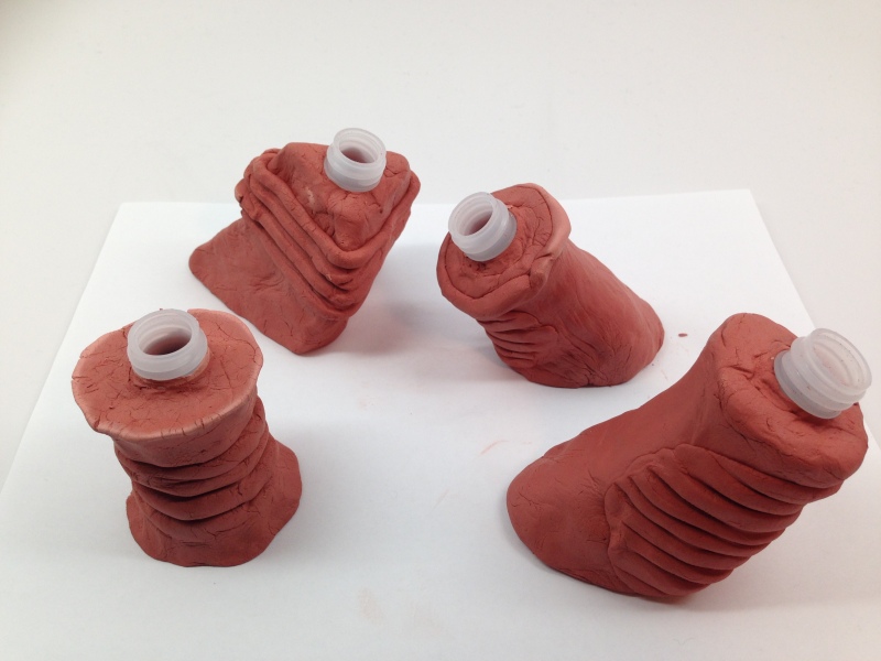
Next step is to make work-like models to test out all the design options, and make changes along the way. Because I am designing pill bottles for the elderly or patients with hand disorders—none of which have I had experience with, I find scientific statistics to further develop my design.
After studying these numbers and statistics I started making models using clay. As I was revisiting the design options I realize some assumptions I had were wrong. For example, why bottles are round. Like I said there are always reasons things are made the way they are. In this case, when human hand close in to holding position, it create a cylinder shape. When you holding a cylinder shaped bottle your whole palm is more likely to get in touch with the surface. But if you are holding a more angular shaped bottle, contradict to what we might think (that it creates more resistance and traction therefore easier to hold onto), it actually creates space in between your hand and the bottle. For people who don’t have problem holding a object the difference might be too insignificant to notice, but for people that are struggling with hand disorders, the space in between create insecurity to the least. So the ideal bottle should be relatively cylinder shaped (or some other shape that can fill in the space in our hands when we are holding the bottle), and it should be around 1.5” in diameter.
Another finding during model making is the slanted design has scientific backing. Like what I quoted from The Measure of Men and Women, wrist motion can be more fatiguing than finger motion. By making the bottle coming at your hand in an angle, it suggests you open the bottle with your wrist and hand at the same reference line and therefore decrease the movement around your wrist. Also, with a open surface exposed to the patients, the bottle welcome patients to hold it the way it’s intended, very intuitively. Grips are added at the other side of the bottle to create more traction.
For caps the principles that are both explored in my early sketches and The Measure of Men and Women are grips and tap handles. They performed really well on the models as well. I did try one more thing that was mentioned in the book, the ball handrail (like the stick control in cars.) I made them around the size of a golf ball so a hand can easily hold onto. But handrail require more wrist motion than finger motion, so it can be more fatiguing for arthritis, physical weakness poliomyelitis, but maybe better for muscular dystrophy and Parkinson’s disease.

Next step to think about is to think taking pills as a system and a series of actions within a space. Where and how pill bottles are stored and displaced are vital to the action of taking medicine. The traditional cabinet might not be the ideal place to store and displace pills, or taking medicine on a daily basis.
I also kept in mind that all the bottle should follow the universal design so it can be used by both lefties and righties.
E. Birth of the Windmill Bottle
F. Re-Design Prescription Label
The original bottle is compact so it doesn’t provide much space for label. The traditional way to attach label is wrap a 4″ * 2″ sticker around the bottle with font size around 12. Patients will need to hold it up closely and turn it around to find the information they need. According to the Guidelines for Prescription Labeling and Consumer Medication Information for People with Vision Loss, the font should be at least 18 in order for patients with vision lost to read without problem. Many people from age 41 to 60 experience vision lost in various degrees, and prescription label should address this problem. Therefore, with the new design, the pill bottle create 40% more pace for prescription label. And with proper separation of the labels of information (barcodes at the bottom for pharmacy, medicine name at the top for patients, etc), it might further help patients to find the right medicine easier.

G. Wrap up
The windmill bottle is designed to keep and refill. The slanted design require a solution to weight down the bottle so that it can stay tilted. I added a magnetic bottom and also further inspired me to have a complimentary tray to go with it. It’s important that the added magnetic bottom can be easily separated when recycle. I also created a cardboard packaging with a set of windmill bottle and board inside. The packaging overall is designed around the 0.5” grip and the windmill shape.
H. Next?
The next step for this project would be the ideal location/environment for the elderly to store/organize the pill and to take the pill. Obviously store them on top of the shelf is not the best solution, so what is? Here are some important date for easy reach work space :lower-high-reach shelves 3”; raise low-reach shelves 3”. lower work tables 1.5”. How should I use this information and all the research I’ve done previously to design the universal “medicine station”?
Reference:
http://nymag.com/nymetro/health/features/11700/index1.html
http://nymag.com/nymetro/health/features/11700/
http://www.nlm.nih.gov/medlineplus/magazine/issues/fall11/articles/fall11pg15.html
http://www.mnn.com/lifestyle/recycling/questions/can-i-recycle-my-used-prescription-bottles
http://digmyworld.blogspot.com/2011/05/pill-thieves-at-walmart-pharmacy.html
http://cbsnewyork.files.wordpress.com/2012/05/drugbottles_g_090225_420_2.jpg?w=420
http://www.wehatetowaste.com/a-creative-solution-to-prescription-drug-disposal/
http://blackdoctor.org/11472/prescription-drug-abuse-on-the-rise/


 A. The Problem.


